The Juicebox/Soup Peddler Project VI
I am terribly sorry for the long lapse between posts on this topic and any associated sense of loss, confusion, or meaninglessness that you may have experienced as a result. Let's pick up where we left off in the story. All is running along basically well. The architects are finished up, the engineers are doing their thing, the banker is finishing up our papers. We're kind of burning through a lot of money, but all is cruising. It's time to work on the design and branding a bit.
I have a complex relationship with branding and packaging. I generally just don't like them. Example: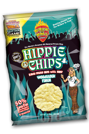
I hate this in a bunch of different ways. I hate it because it commercializes and degrades hippies (please don't bring this up. It completely blows this argument.). I hate it because of its blithe assurance of "all natural," a term which seems to exclude no terrestrial substances. I hate it because it says "World's Greatest." I hate it because it says "Woodstock." I hate it because it says "For The Rocker In You." But do I hate it any more than this?
Tough call. It's easy to lambast the obvious enemies of sensibility such as chicken dinosaurs, but frankly the truth to lie ratio is about even on the two packages.
Here's the problem. As much as I can't stand brands and packaging, they're still something that we use to navigate our world of consumption, and when they're done right, they're not offensive at all. Of course you need a name, right? You can do punny, you can do old-fashioned self-descriptive, and you can do mod. I think those are the only choices. Punny is something like "Sew Much More" or "Sew Easy". In fact, over 85% of sewing stores have punny names. Old-fashioned is "The Ice Cream Man" or "The Flower Shoppe" or really any business that uses the word "Shoppe" or "Olde" or "Ye". Mod is probably the most common branding trend these days. The shorter the better. Baby store named "Waa". White tablecloth barbecue joint called "Rib". If you can exclude letters entirely, all the better... you get down to the bare basics, like a novelty shop called "?!" or a gastroenterology practice called ":".
Where was I? Right. I was about to defend the Great Truths behind The Soup Peddler brand. Like it or not, I'm the man behind a brand myself. The Soup Peddler conforms to both the old-fashioned and punny models of branding. Well. We all know that The Soup Peddler doesn't pedal soups to his little neighborhood of Soupies anymore. I probably could a little bit. Maybe I should. Okay, maybe I will. I do remember, though, long before most of you knew me or heard of me, deciding whether to spell it "peddler" or "pedaler" and I am sure glad I chose the former. I wisely thought, "There'll come a day..." The nice thing about my brand is that there is at least a real "brand story" behind the brand. A thin veneer, I'll admit, but there's a grain of truth.
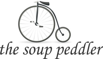
Permit me a little flashback: Here's a peek at the first flyer that I designed for Soup Peddler.

Note the absence of the name Soup Peddler. It was only after a few weeks in business that I discovered the punny cleverness that is The Soup Peddler. I grabbed a .jpg of a pennyfarthing off the internet somewhere and utilized a particularly Olde Tyme sort of typeface and put together the logo we all know and love. Lots of folks have come along to try to update it. A Linux logo designer I stayed with in Italy tried to update the bicycle:
Which I kind of liked. When I asked the Soupies if I should change the logo to this, they shot it down. Another design firm tried to sell me on their services with a cartoonish logo of a bicyclist with a bowl of soup on his head and motion lines indicating the speed of my deliveries. I sadly don't have that file anymore.
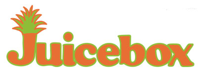
When we set out to do this mashup business, Matt and I discovered that we would not be able to use the Daily Juice brand... a long story with a surprisingly complex corporate structure behind it. We needed to do what we were both kind of reluctant to do: invent a new brand for the juice portion of the store. We kicked around a bit of the old-fashioned self-explanatory: "Austin Juice Co." We tinkered a bit with the mod: "Slurp". "Ooze". None of this fit Matt's persona or style, really. But then we finally settled on something that came from our literally little architectural situation, our little box on the corner of Lamar and Manchaca, something with a half-measure of self-explanatory and half-measure of mod: "Juicebox".
Both Matt and I were fortunate to be acquainted with the lovely, the talented Jennifer Braham of Brink Creative. Jennifer is a design phenom whose work colors much of Austin... her work for Uchi (timeless), The Peacock (well-designed but doomed), Kick Pleat, Big Red Sun, etc., is unwaveringly excellent and sophisticated. We went to her with vague notions and rode on her magic carpet, witnessed her prodigious output, and basically followed her lead in a choose-your-own-adventure design process.
She interwove my input ("How about a little more serif?") with Matt's ("I need something kind of like a 21st Century tiki hut mixed with old-school hip hop and robots") with aplomb and grace. Each visit we would scan ten different options, choose one direction, and come back the next with to find ten different branches off that idea. It was stunning. She is a serious pixel-pusher and approaches the work with boundless whimsy. An honor to be part of her process. But still, it was strange to put the cart before the horse, to design a brand for a business that didn't exist. I guess that's how it's done.
Here was part of Round 1:
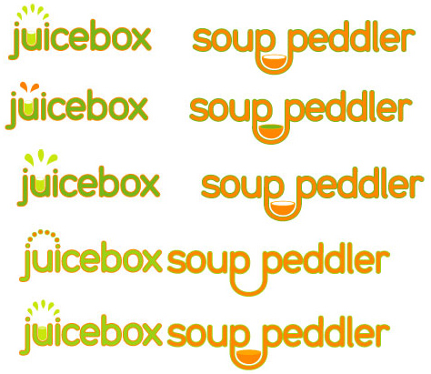
Fresh! Inviting! Simple! Combines the brands in a palatable way. We showed it to our respective wives and got a double (er, quadruple) thumbs-down. Too Mall Court. Too Chili's. In fact, Jennifer was having a very hard time with my brand because it's so elemental and complete and burned into her brain. She was reluctant to change it but tried her best. I was excited about a break with the past, a move into the future; it's something we all yearn for in one way or another. But after Meredith said "Chili's", I could never look at it without thinking Chili's. Like when an old girlfriend said that my favorite Joe Satriani song sounded like the theme from Top Gun, it was ruined forever.
We decided to let the Soup Peddler brand rest and focus on ways to develop Juicebox as similar but different, complementary but contrasty.
Jovial. Homemade. Pineapple-y. Matt walked around Jennifer's office trying it on, trying to feel the new brand and see if he could physically embody it. He understandably has a very, very strong affiliation with the Daily Juice brand, so this whole process has been fraught with weirdness for him. For the founder of a business, for these real, bootstrapped brands, there is such a strong identification that it becomes very personal. So there's a bit of an adulterous element here for Matt, there's a lot of hesitance and trepidation. Ultimately, he didn't feel it for this design. He gave Jennifer a raft of confusing, conflicting directives on where to go next. She gave it another shot.

This met with Matt's unadulterated enthusiasm. It took me a few minutes to get with him on it but his attitude was infectious. He sold me on Mr. Juicy by strutting robotically around the room. Mr. Juicy is, essentially, Matt Shook in avatar form. Fresh, enthusiastic, constantly on the move. There's also a kind of compatibility between this and Soup Peddler, that slightly asymmetrical off-kilterness. Contrasty in style, the typefaces are nice together. And Jennifer even made a little girlfriend for Mr. Juicy. Lucy Soupie:

(stay tuned for themes of impending disaster...)